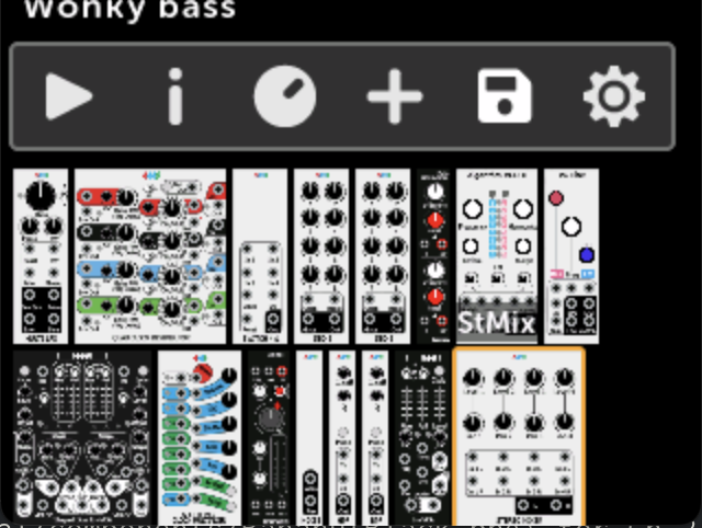
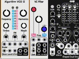
I really love the new fullscreen view on modules.
the modules look so much better, clear/crisp and readable.
however, it really makes me wish that this was the ‘norm’ for the main patch view.
rather than squishing the panels so we can get the squeeze the menu on to the screen too.
which, I kind of think is a bit of a waste of screen space (on an already small screen), since you can only use the menu when you move the ‘cursor’ to it. (unlike a wimp interface)
so I was thinking of some alternatives (that are close to what we have already)
menu
a) hide menu - use back button to activate.
this is actually very similar to what we have already.
just don’t show the menu at all, only bring it up when the back button is shown… and then it can even be drawn over the modules.
why is this similar?
well, when we scroll to second row etc, the menu is not shown … and you can get back to it with the back button.
the main difference is using full panel height.
b) vertical menu
I personally think the menu icons are larger than they need to be, if you compare to panel buttons etc.
I was thinking if they were a little bit smaller they could be a vertical strip, e.g. on the first row, also full height.
i.e. a very similar design to how it is now, just in a vertical placement, almost like a fake module.
this could even have patch name (albeit it have to be rotate’d 90 deg) and cpu load.
for some this may be preferable to (a), as I recognise hiding the menu for new users MAY not be intuitive, that said we already use BACK to get to the NEW/LOAD patch menu… so one could argue its already a hierarchal ui (which is fine by me :))
downsides?
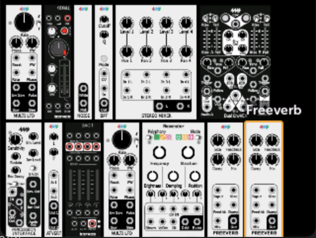
I guess the main one is patch cables, if you only show a row, then you cannot see patch cables destination to next row, as you can only see one row at a time.
not sure this is a big thing, as the patching within MM doesn’t work visually anyway its done via connection menu.
also this only really works where modules have jacks at the bottom/top of panel
(as you currently get to see about 15% (?) of other row)
more horizontal modules / rack width
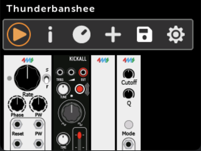
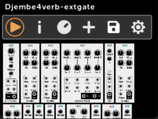
currently the MM keeps one screen width of modules per row, before it overflows to next row.
I do wonder why?
I wonder if perhaps this could be extended, so that the screen also can scroll horizontally.
in terms of control with encoder it’d work the same, as you scroll the encoder it just moves to next module, the difference being, it now can scroll horizontally (as well as vertically) as needed.
I think if the patch cables had a bit less ‘loop’ on them, this might show connections better in many cases. (though as above, Im not that fussed about seeing cables)
as for how the users chooses?
I think a simple patch setting for ‘rack width in HP’ would be enough.
ofc, it can default to its current width for backwards compatibility / those that like it as is.
complication: very wide module panels, theoretically a panel could be too wide to fit on screen, like now.. these would have to be allow on a single row regardless of rack width.
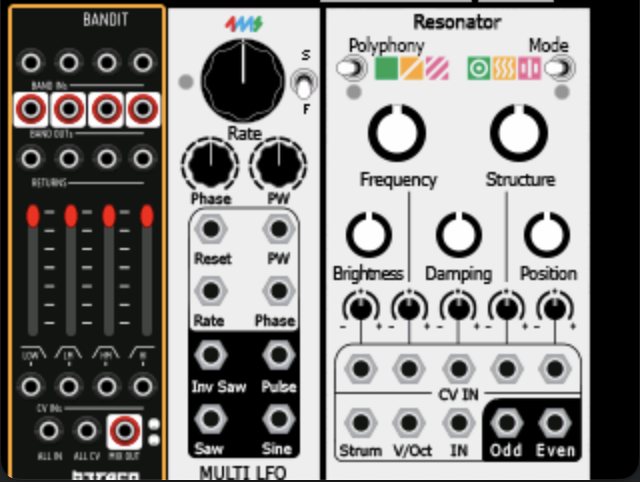
really both ideas are kind of similar, really the new fullscreen module view has demonstrated (to me), how much better panels look when a they are full height. ( * )
( * ) ymmv, depending on fonts etc they use, some look a bit better, some look a lot better.
anyway, just thought Id throw out some ideas.